Expedia Group
Building an accessible color palette
Taking initiative to expand the design system and improve accessibility
Context
Bringing accessibility to the forefront
I firmly believe that accessibility should be vital to every product design process. However, when I joined Egencia, Expedia Group's business travel brand, many basic accessibility guidelines hadn't been considered. I made it a goal to change this, beginning with a self-initiated project to improve the color contrast ratios for text and icons.
Egencia's muted, low-contrast color palette made reading text challenging for anyone with and without low vision. And with very few color options, the design team had a limited ability to communicate effectively through color.
Where Egencia's colors stood
Egencia's existing palette was extremely monochromatic, consisting primarily of grays and blues with single shades of alternate colors. When measured against standard WCAG contrast ratio guidelines, 6 of our ten colors failed for the small text they were being used for at the time.
The colors blue, green, yellow, and red serve as essential communication tools for business travelers, letting them know if a hotel is booked successfully, a flight is delayed, or something in their itinerary was unexpectedly canceled. None of those items passed the baseline standard, making it clear how significant these changes would be to our product.

Goals
A palette that's easier for both travelers and designers to utilize
I started the project with some primary goals: to expand our palette to include multiple shades of each color for light and dark backgrounds and that all colors have one shade that passes at least AA+ (large font), with the majority passing AA (baseline).
My role
Owner of design and implementation
Taking the lead
I took the lead on this project, working in my spare time outside my product role to explore color options, manipulate hex codes, and get feedback from my fellow designers. The goal was to keep the core brand and personality the same but expand the color toolkit for greater accessibility.
Collaborating with brand and marketing
This project included working closely with the marketing team, who worked within strict color guidelines. Because of this, I decided not to change the colors included in our brand styles and instead created darker and lighter shades of each to be used only in the product. We determined when and where each color should be used across both sides.
Overseeing implementation
To implement this change across the product, I had to coordinate with every product team to ensure the new colors would be implemented effectively. I worked with each design lead to audit every text color being used in the product to make sure what they were changed to would be the correct contrast level. I also partnered with a fellow designer on my team to create detailed documentation on usage for our developers, which can be found here.
The solution
A broadened, versatile color family
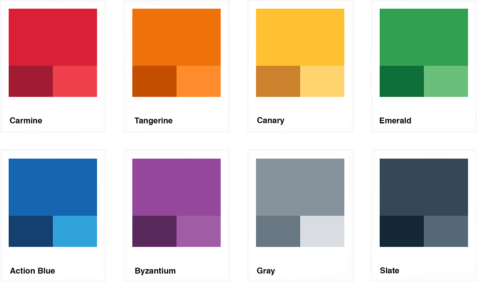
The new color palette included three shades for each hue: dark, medium, and light, allowing options for accessible usage on both dark and light backgrounds. I also cleaned up the RGB values to make the colors crisper and more vibrant, still without making any changes to the core hues of the brand.
Additionally, I added Orange to the palette, as we had previously been using Yellow for warning text. This was largely inaccessible and confusing, as Yellow also served as our primary brand identifier. Adding an Orange specifically for warnings allowed users to quickly and easily identify urgent items.

The final new color palette
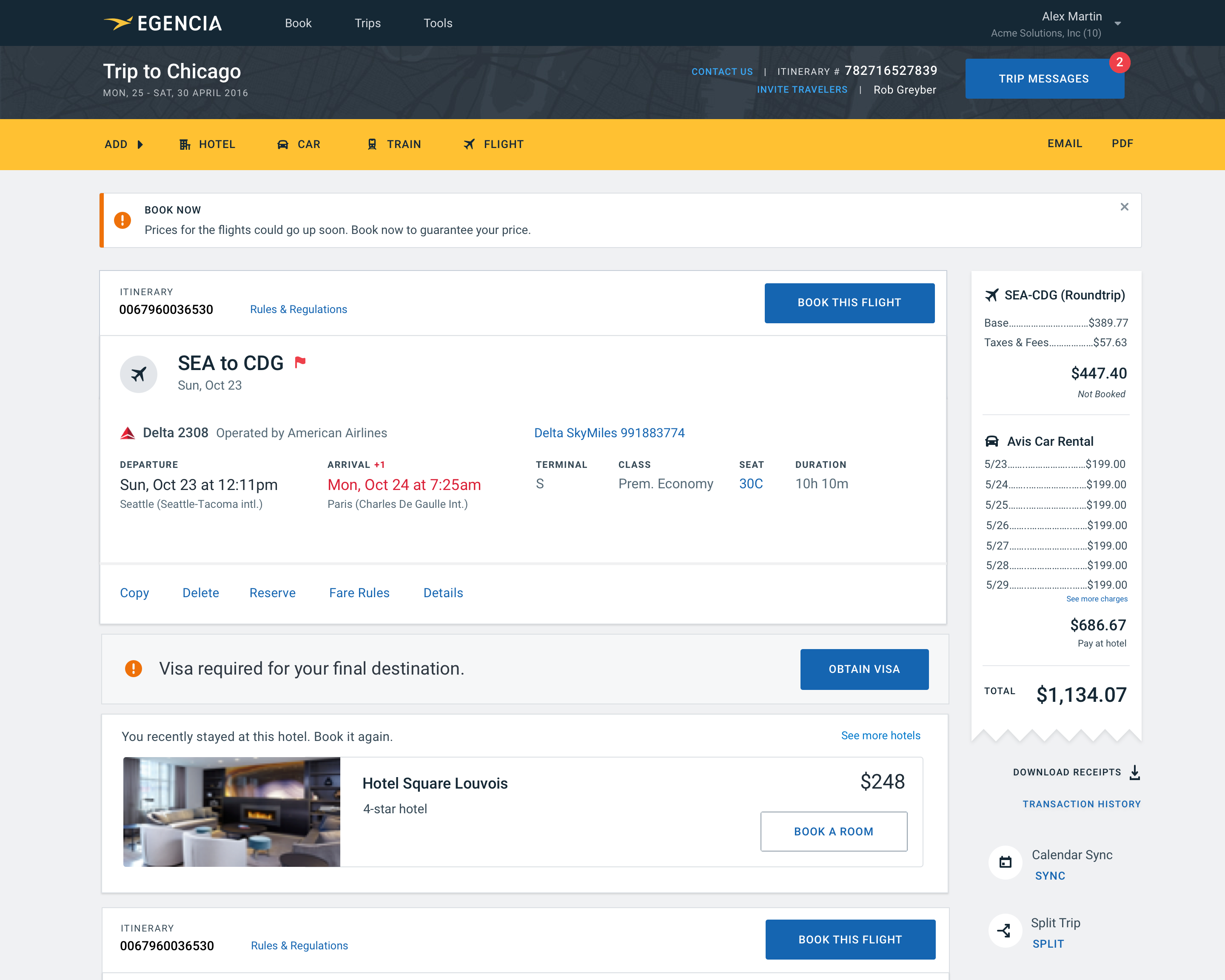
Colors in action
How the new colors measure up
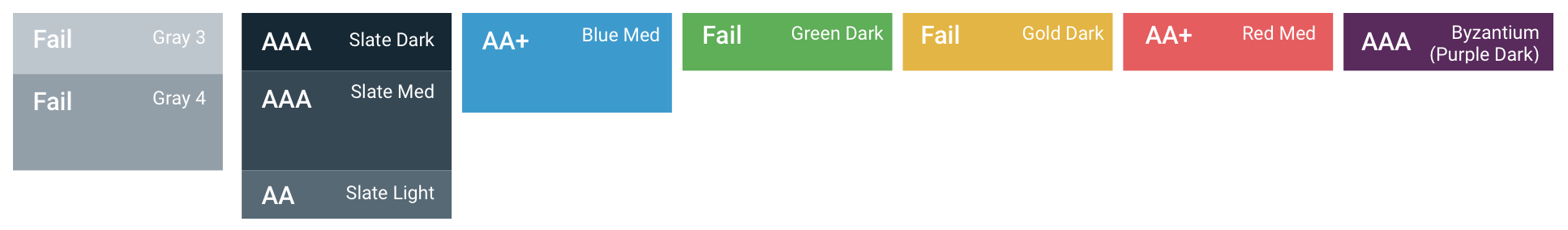
Before, 4 of 10 colors pass at AA or higher.
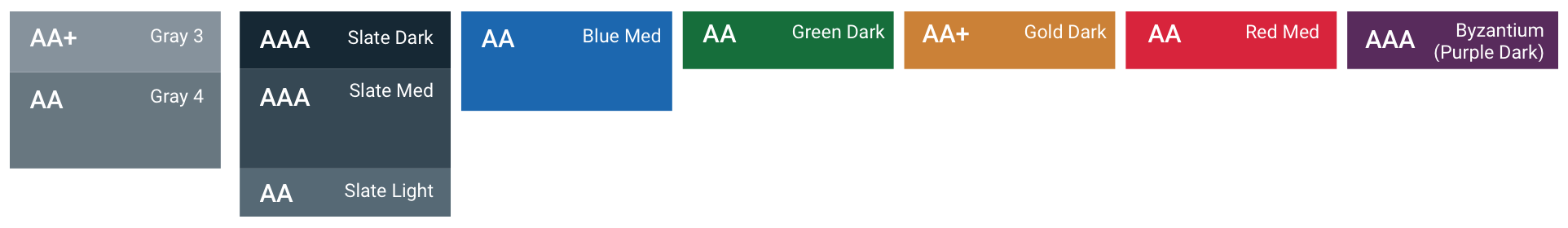
After, 8 of 10 core colors pass at AA or higher.
Use the slider below to view the Egencia product before and after our color changes. All text on the page now passes with at least an AA (4.5+) rating, and all critical decoration elements (icons) pass with at least AA Large (3.0+).

The impact
Opening the door for greater accessibility
Beyond the immediate improvements to our contrast ratios, this project significantly impacted the business as the first accessibility project at Egencia. Shortly after the launch, an internal initiative surrounding accessibility was launched. Training sessions were scheduled for engineers to learn more about other accessibility considerations, like screen readers and keyboard shortcuts.
I brought my learnings from this project as a guest speaker at The Product School, educating product managers in training about the importance of accessibility for users and businesses, the meaning of accessibility guidelines, and how they make these kinds of improvements in their products. That presentation can be found here.
More projects
© Sarah Gorman 2023