Untapped
Improving hiring filters to highlight top talent
Delivering core business values with a thoughtful design update
Context
Bringing the right candidates to the forefront
At Untapped, a recruiting platform dedicated to driving diversity and inclusion, one of the core values was to help recruiters discover underserved candidates they may not have considered in their traditional workflow. When setting the product roadmap for 2022, living up to this value was top of mind.
After brainstorming with the product team, three big bets were chosen as our product strategy. As designer and pod lead for the recruiter experience team, we would aim to enhance candidate discovery in sourcing.
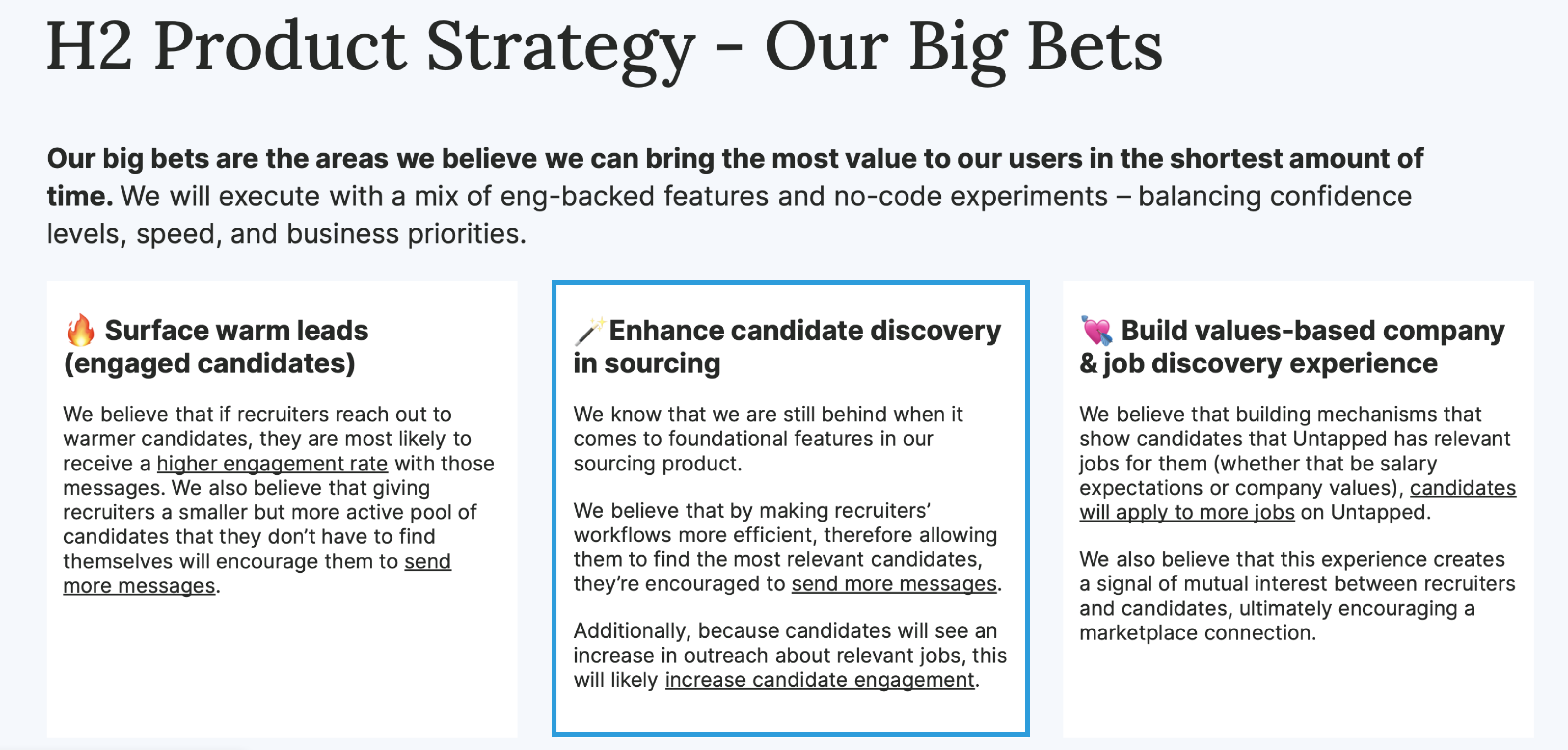
Our three main product priorities going into this project.
Project Goal
Make the recruiter workflow faster and more efficient, giving them an easier way to source talent with diverse backgrounds that best meet the needs for a role.
My role
Led design, research, and product strategy
Conducted a large-scale research study with targeted recruiters
To discover how we could best improve the recruiter workflow, I conducted a research study with thirteen recruiters from all different backgrounds who were a mix of current users and the ideal customer profile we were targeting as a business. I gathered insights into their workflow and determined their top values and pain points. Details of those findings can be found here.
Presented analysis to determine the product strategy
I presented my analysis across the company to our leadership team, customer success managers, and product managers. Together, we determined that we could address the needs of our current customers and future users by focusing on the filters they use in their talent pool while sourcing for open roles. This would be the most effective first step into speeding up the hiring process and bringing unseen talent to the forefront.
Made focused design improvements to drive forward the vision
Once filters became the main focus, I designed and tested several different options, including both long-term and short-term changes we could make. After gathering feedback, I consolidated the updates into two key changes for our first launch: making vital user interface improvements across our existing filters and creating an easy way to discover underrepresented talent.
Focusing on filters
Testing two different directions
When discussing what improvements could be made to help recruiters find candidates better, filters continuously came up in conversations with the customer success team and active users.
Navigating filters took up a lot of time and space, living in a multi-tier dropdown menu with long scrolling lists recruiters had to comb through.
“Filters take up so much of the screen that I barely even notice the candidates in my results.”
–Direct feedback from an Untapped recruiter
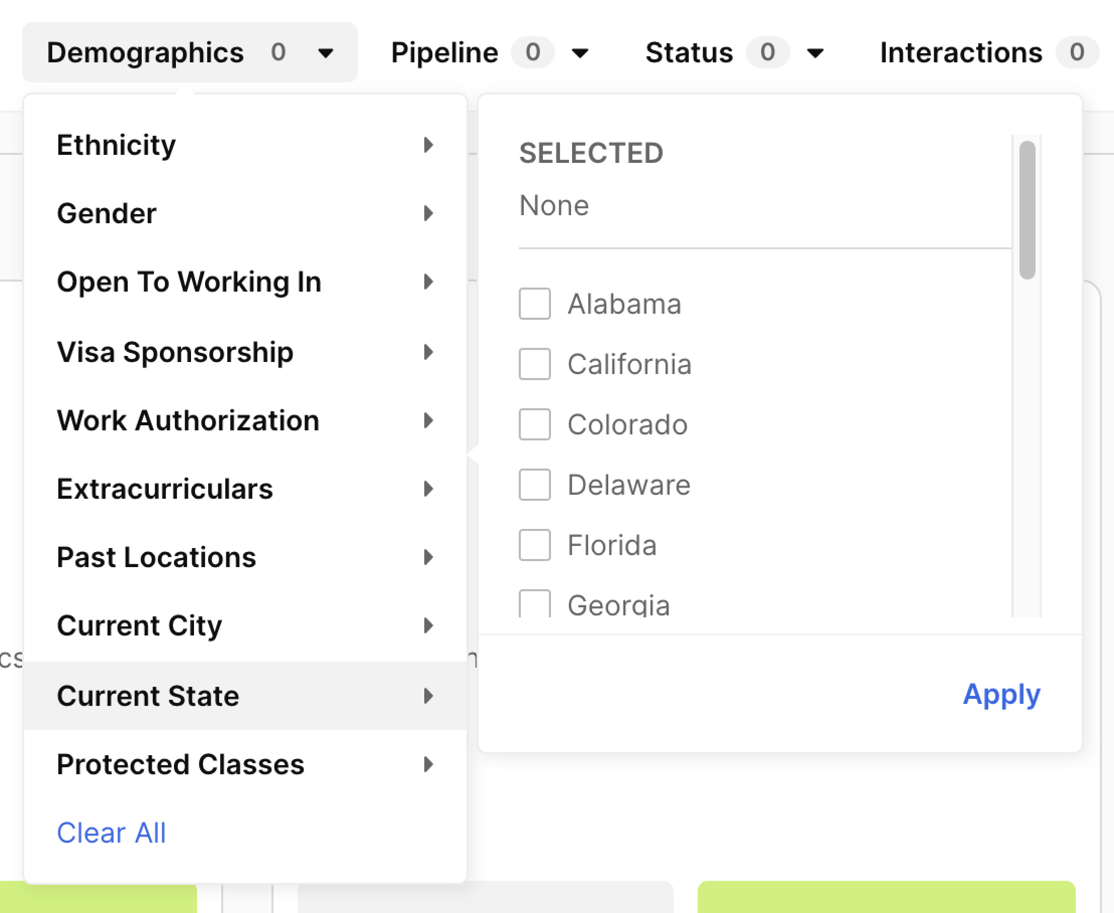
Existing filters required scrolling and four clicks to apply.
After conducting extensive research from direct competitors and commonly used tools with filters, like travel and shopping sites, and leading several collaborative product and design team brainstorms, I landed on two different directions for how to approach our filters.
The first was a high-complexity version: moving the filters to a left-side panel that could list as many filter options as possible without size limitation. The second was a less complex update: keeping filters on the top bar but improving the size and navigation of the dropdowns.
The two different filter placements I considered and tested.
I tested two different versions of a recruiter's experience sourcing candidates. Everything on the page was the same, the only difference being the two options for filter placement. The recruiters we tested with revealed that the filters' location did not impact meeting their needs while sourcing.
I had guessed that left-side filters would be preferred– they were commonly seen on other job sites and allowed for higher visibility into the filters themselves. But ultimately, these test results showed that investing additional time and engineering resources into changing the page layout wasn't necessary. We could make a greater impact faster just with changes to the existing filter placement.
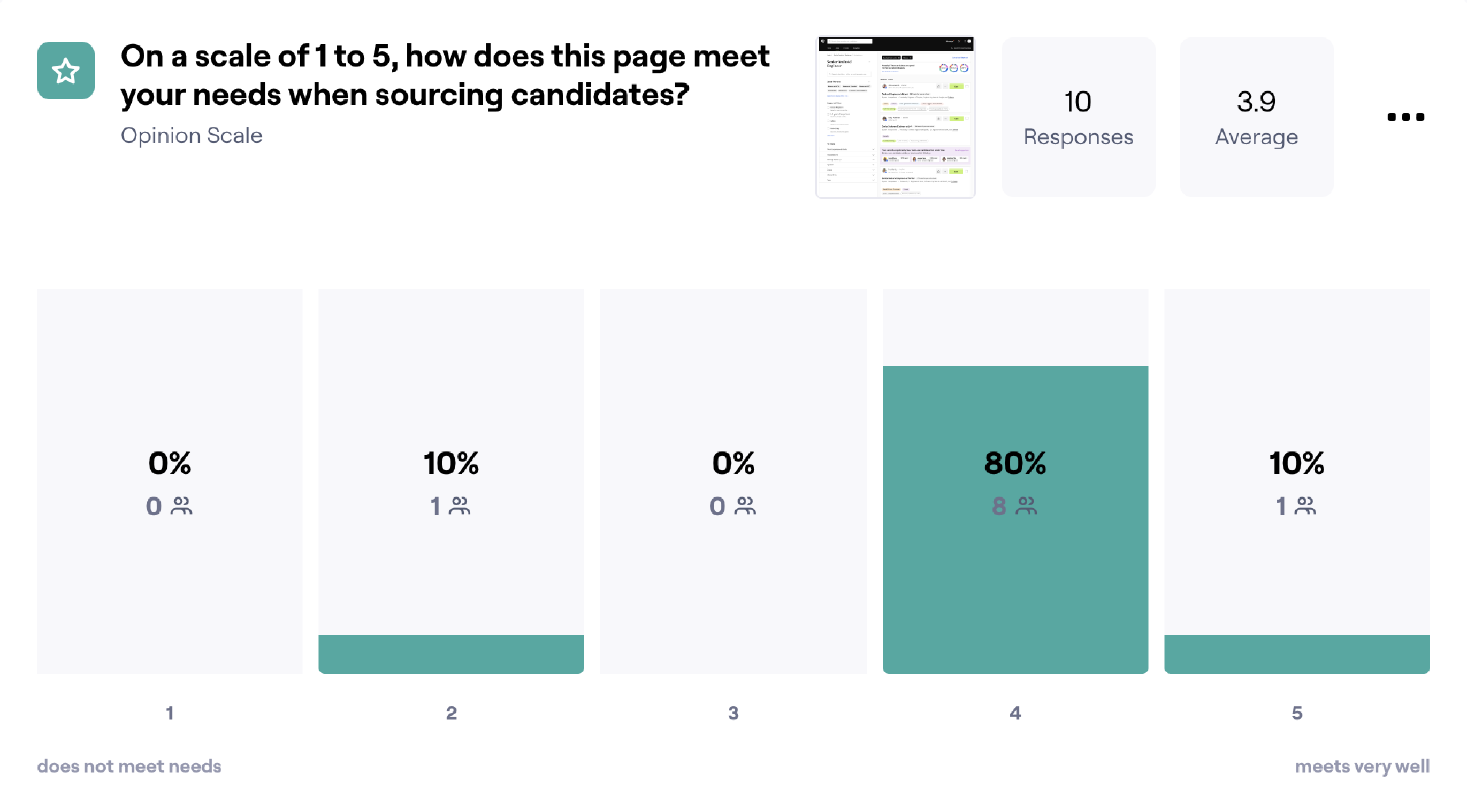
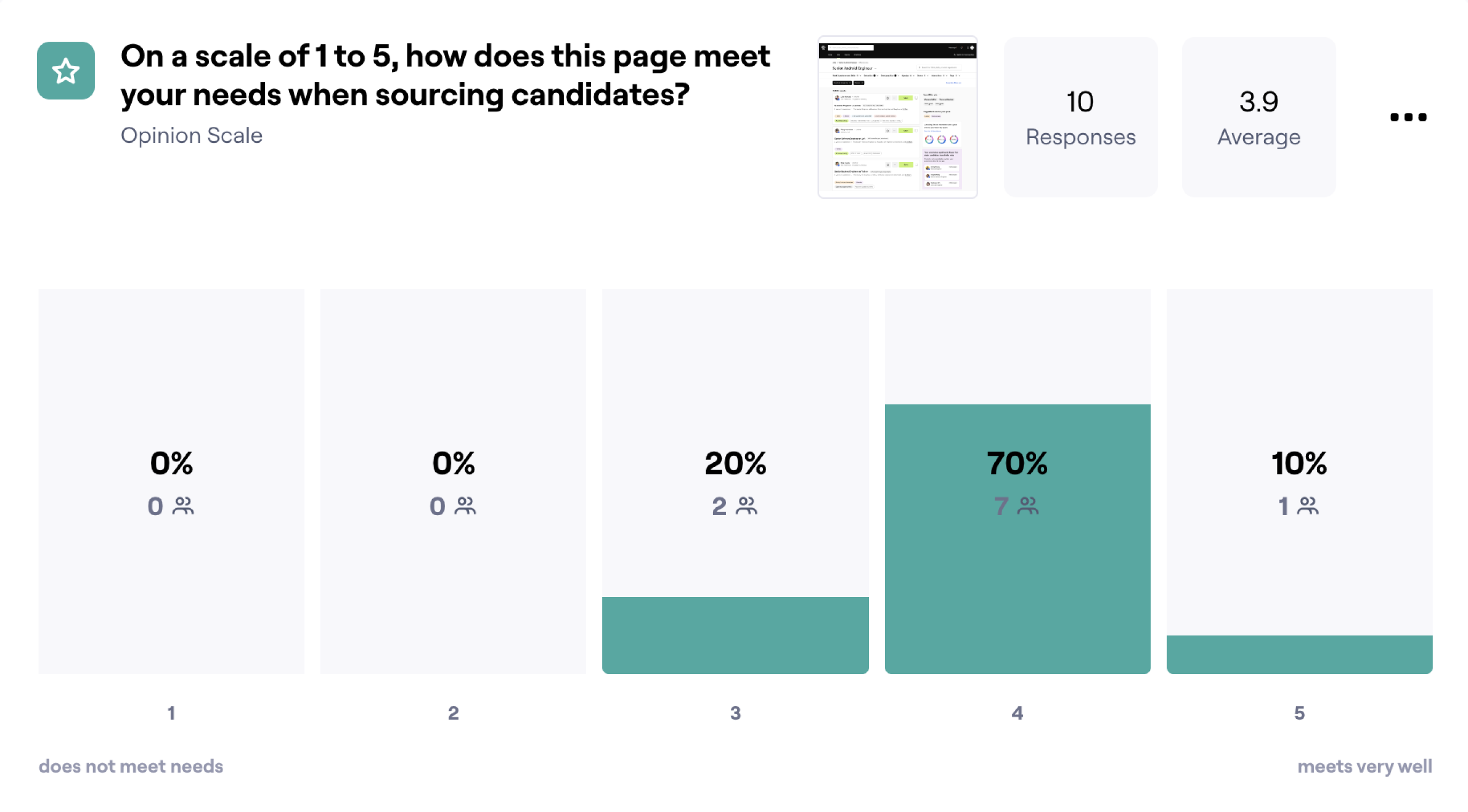
Both approaches to filters averaged a 3.9/5.
These test results gave me a clear direction and revealed room for improvement. I wanted to deliver an excellent sourcing experience for recruiters, but 3.9/5 was below the score I would strive for. I took a closer look at the test results and found a few comments that gave me more insight into what else could be done.
The feedback showed that recruiters found our filters to be too general. They wanted to immediately filter for the few key items in their sourcing flow and actually found having too many options confusing or overwhelming. It wasn't just the interface of the dropdowns that could improve, but the presentation and organization of each filter category.
Rethinking and reorganizing
Assessing our current filter categorizations
I began auditing our current filters, cross-referencing with the filters flagged as most important to existing customers and the recruiters I tested with.
I found there were three critical categories: Untapped talent, traditionally underserved identities tied directly to Untapped's mission of championing equity and inclusion; qualification filters, the top-used criteria that correlate with a recruiter's specific job requirements; and advanced filters, lesser-used filters defined by the company's previous interactions with a candidate.
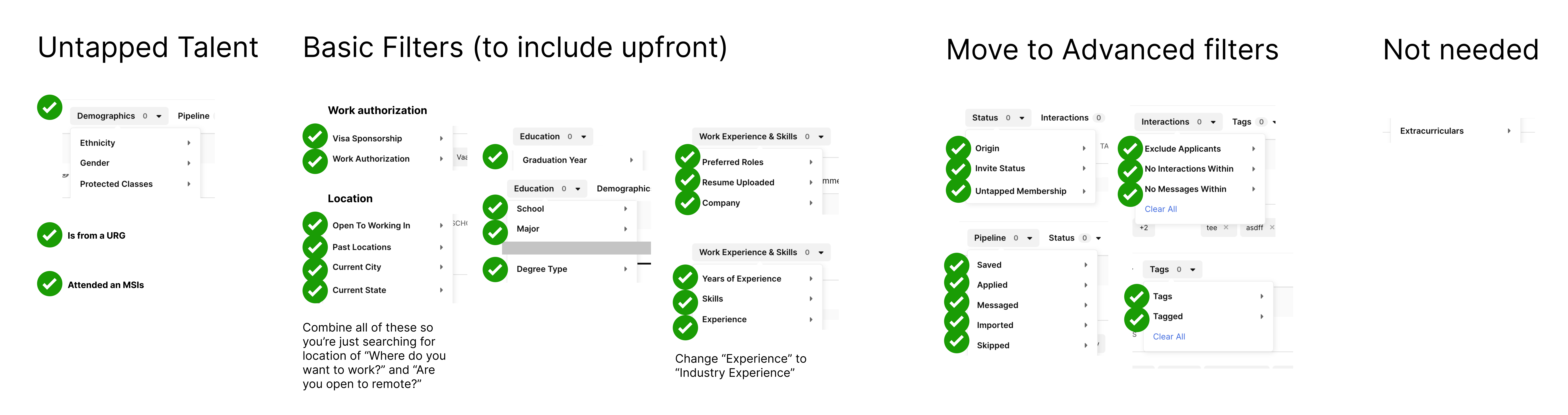
Organizing our existing filters by function and priority.
The next step was organizing filters into groups that were easy to understand and correlated with the recruiter's mindset while sourcing candidates. I also wanted to limit the number of categories we showed to less than six so users could consider their options without getting overwhelmed.
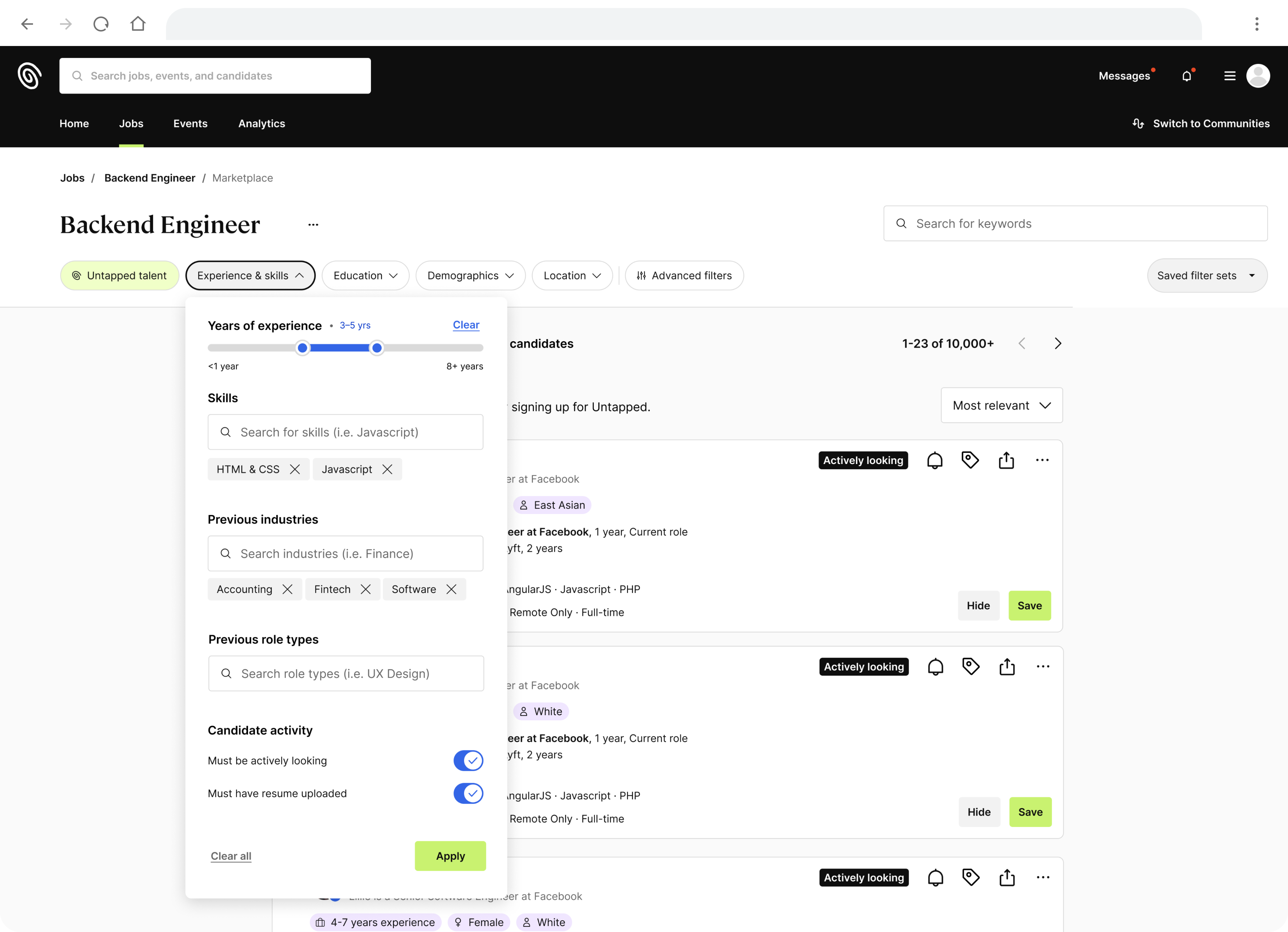
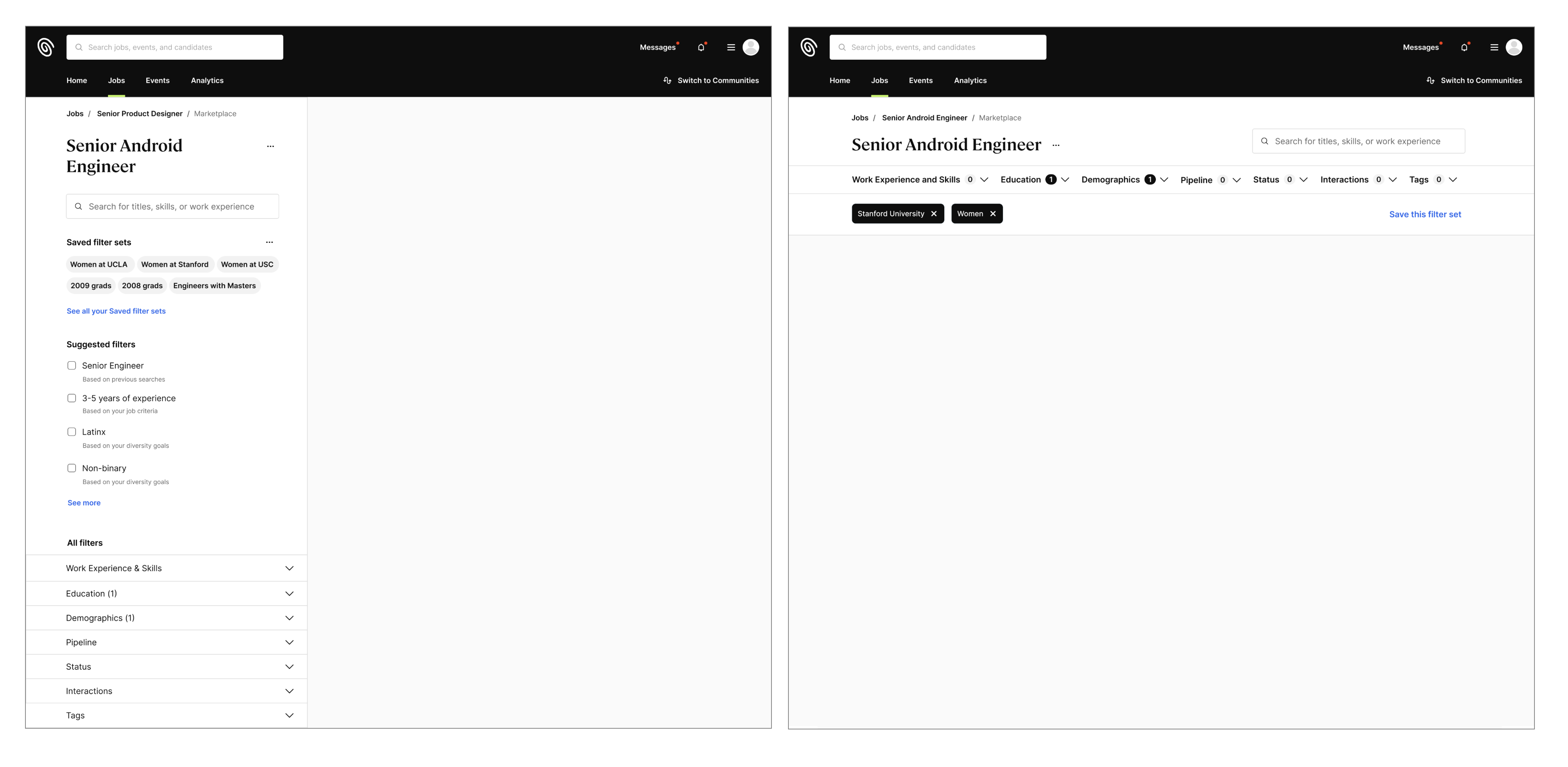
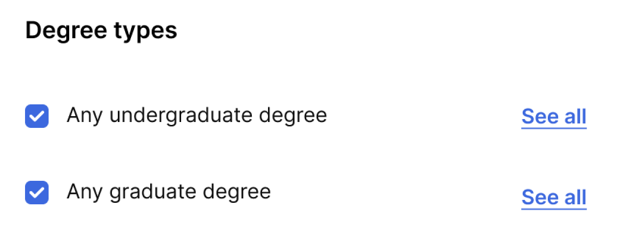
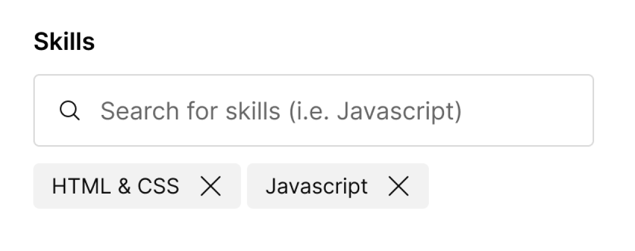
I landed on four main groups that reflected the core items recruiters look for Untapped talent, experience and skills, location, and education. This would give the page four main filter dropdowns, with additional advanced filters that would open in a modal to allow for more detailed interactions.
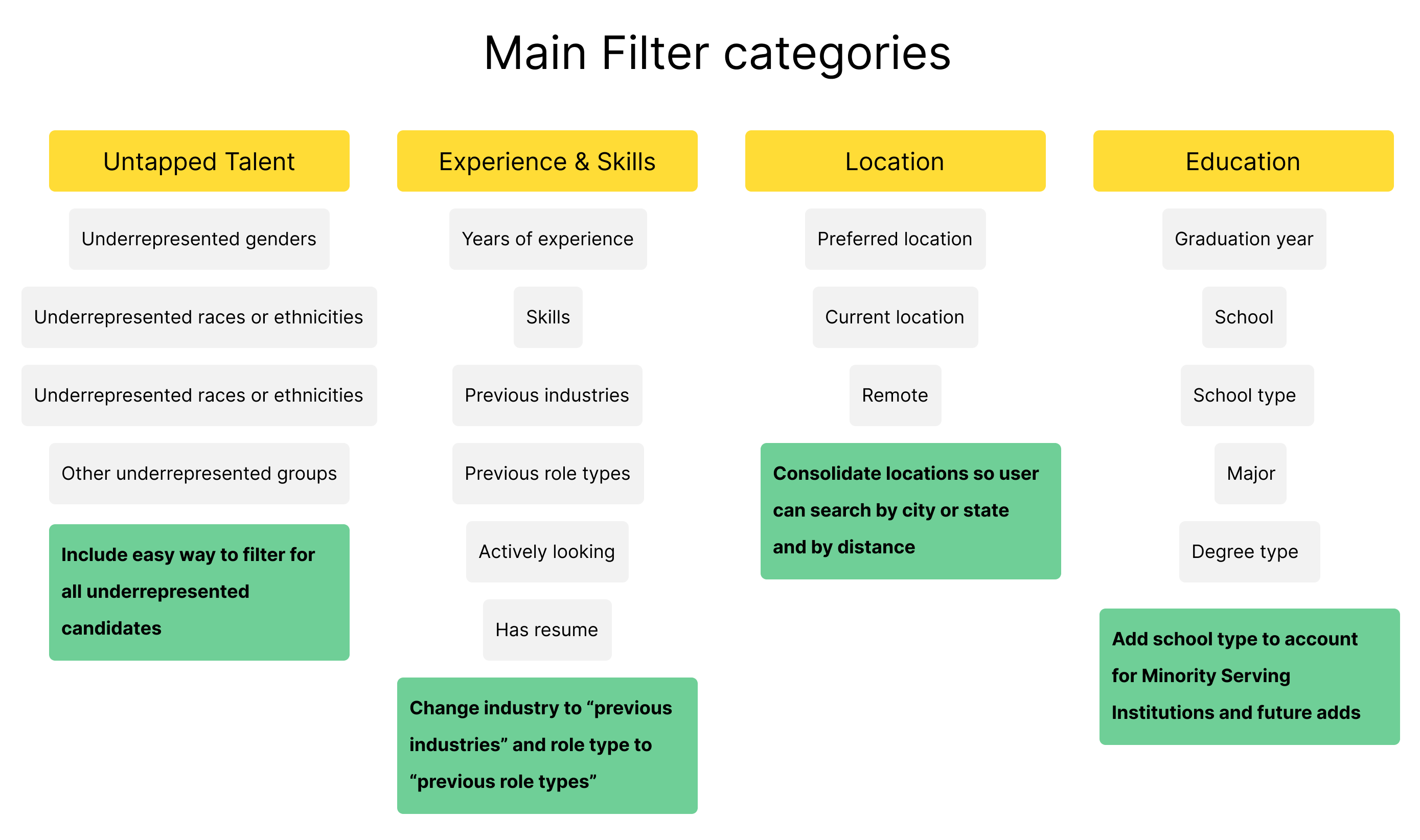
Grouping key filters into four clear dropdowns.
Improving the interactions
Designing with simplicity in mind
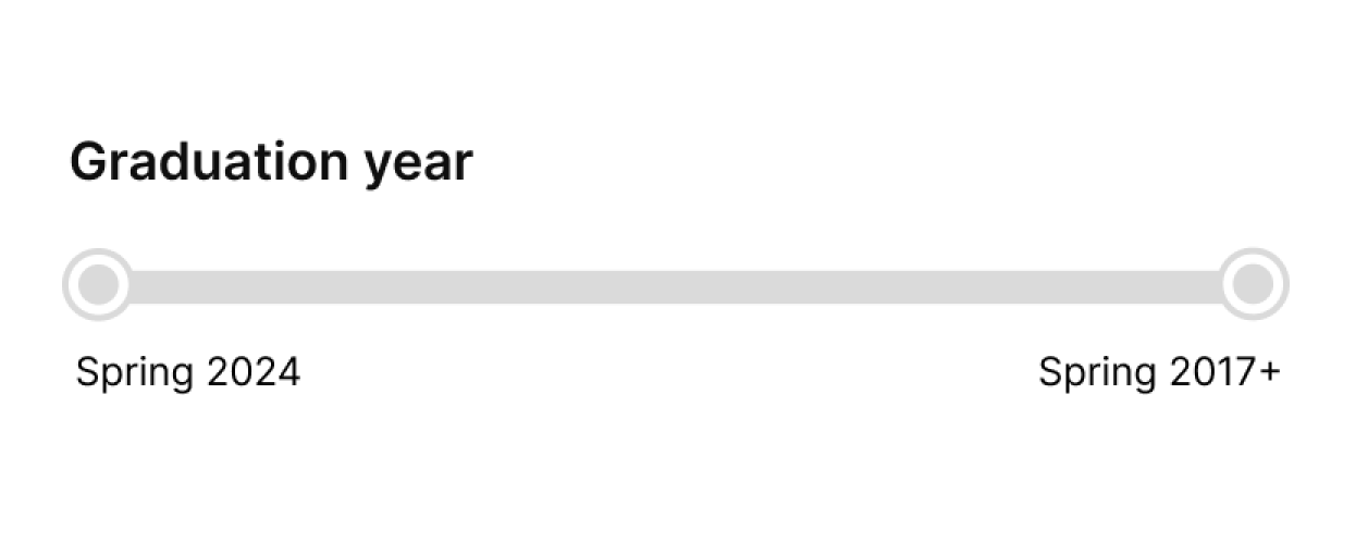
Now that the filters were grouped, I evaluated the actual functionality of each category. Our existing filters had three interaction types: checkboxes, search fields, and radio buttons, but none had consistent rules for usage. Categories like graduation year were sorted in a long list where recruiters had to click each year and semester they sought rather than being able to select a range.
After researching design patterns and trying out different options, I determined four interaction types worked best for our range of filters.
1. Checkboxes
Used finite lists of items, especially where recruiters are likely to select all. These may also be used for secondary items related to a broader category.
2. Search fields
For longer lists of items, or organic categories open to change.
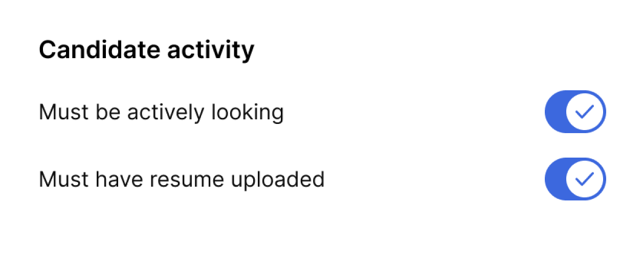
3. Toggles
For yes or no questions, on/off functions, or hard requirements
4. Steppers
For items that fall into a range, like year, time, or distance.
Checkbox buckets.
Search fields.
Toggles.
Steppers.
The final designs
When completing the designs, I focused closely on efficiency, ease of use, and the ability to discover underserved talent. Each dropdown was designed to fit comfortably on the recruiter's screen or require minimal scrolling,
To showcase diverse talent, I highlighted the "Untapped talent" filter. I also color-coordinated the underrepresented groups candidates belonged to in the results when the filter is applied, allowing the recruiter to immediately see the unique backgrounds each person could bring to their team.
Recruiters' talent pool with the new filter functionality.
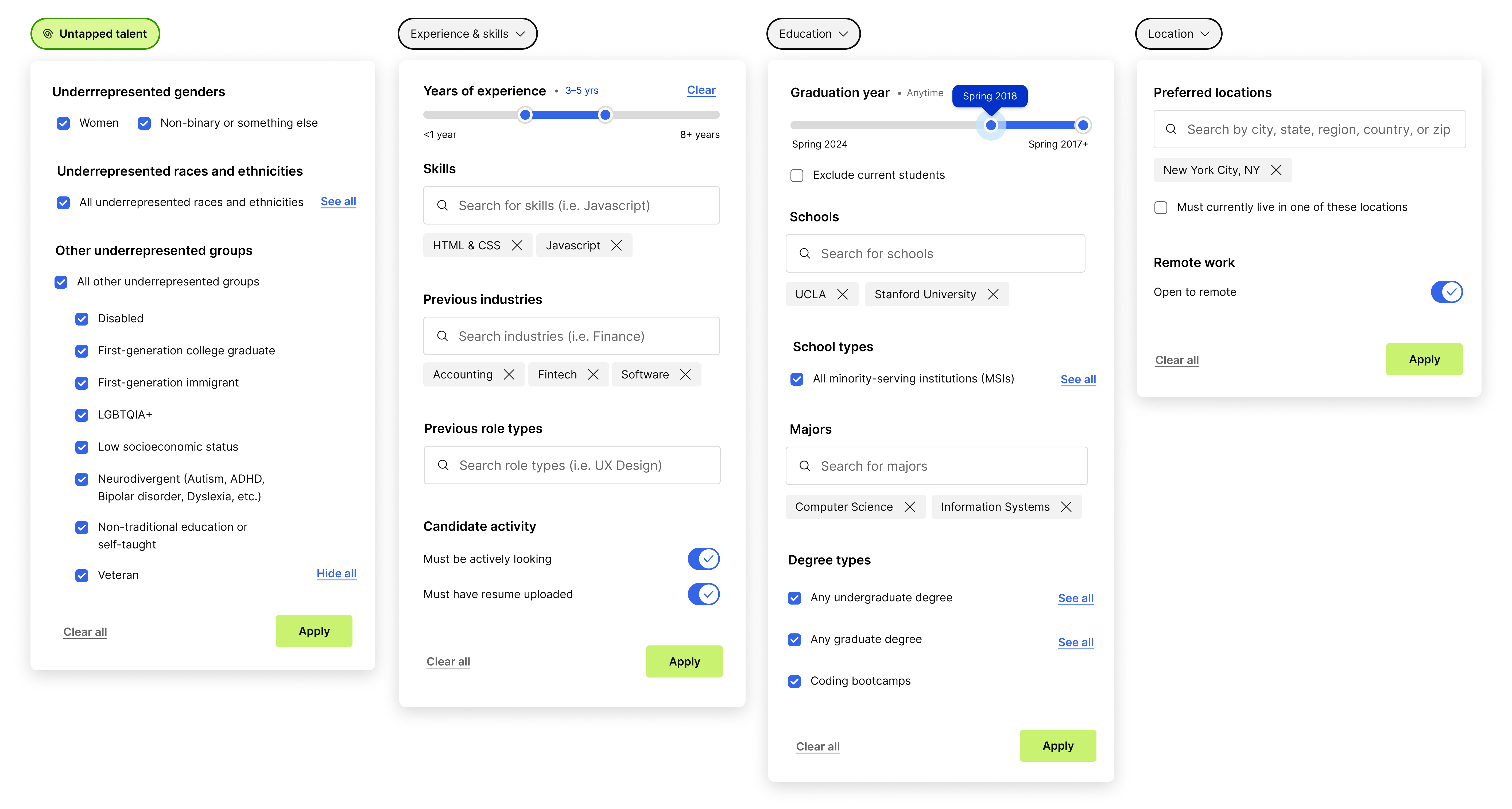
Details of each new filter dropdown.
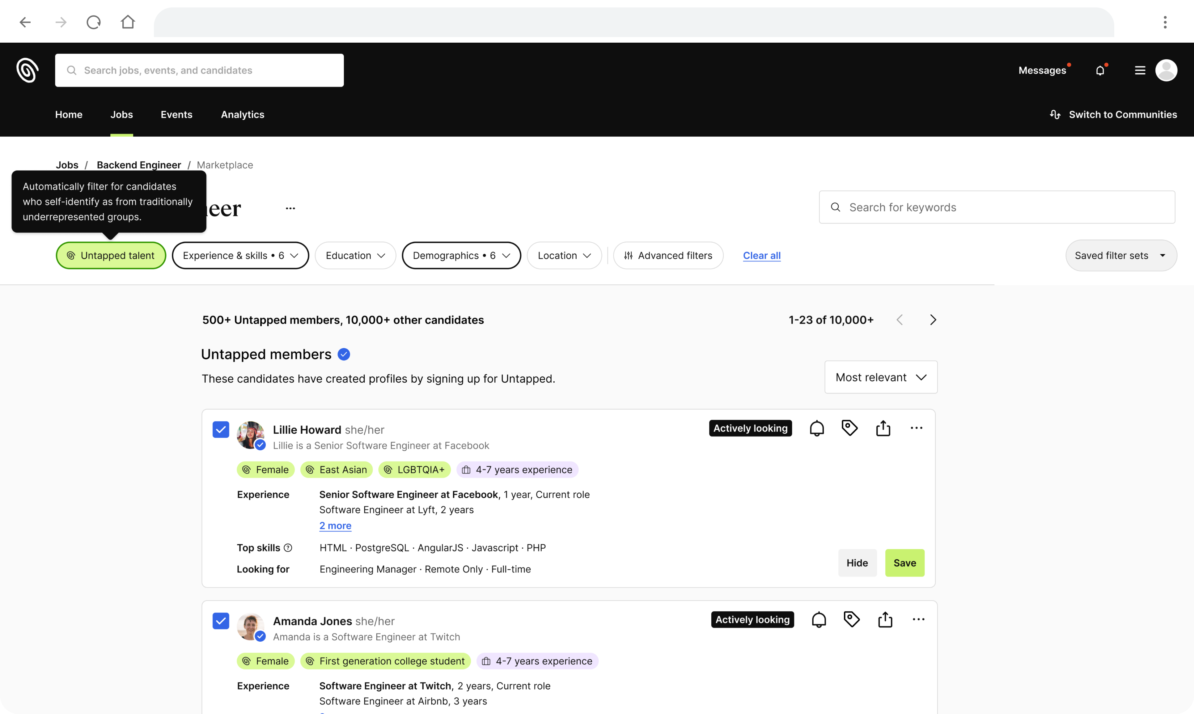
Untapped talent qualifiers are now highlighted on the candidate card when applied.
The impact
This filters overhaul marked the first significant update to our recruiter experience in over two years. It was our first time setting a broad product strategy as a team, as the prior approach had been making small, incremental changes, often based on customer requests alone. The initiative balanced high-impact and medium technical effort that served as a blueprint for the future.
We measured the clicks and unique users of the filters after release, and even the first few weeks saw an increase in usage. In particular, there was a noticeable climb in the usage of unique users using Demographic filters, most likely leading to increased visibility for underrepresented candidates.
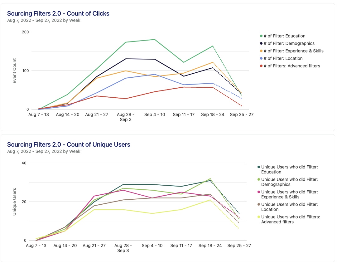
Filter usage steadily increased in the weeks after launching.
I also worked with our Customer Success team to get direct feedback from recruiters and got an overwhelmingly positive response. Recruiters noted that they found filters much easier to navigate and implement into their workflow.
“I think the best feature is the filters that you have within the candidates. You can really get to the granular aspect.”
–A recruiter sharing feedback about Untapped after the release
After launch, we continued to iterate on new additions, including adding a distance range to the location category and additional underrepresented identity groups. This project also played a key role in our product goal of increasing engagement between recruiters and candidates, which grew 10x year over year between 2022 and 2023.
More projects
© Sarah Gorman 2023